
Figure 1: The Beauty of Tennis. Source: https://giphy.com/search/tennis
R is very much like tennis… precise, beautiful, plastic
… and also painfully fun 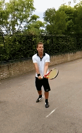
In this short tutorial, we will learn how to make a cool hex sticker for your project, package or simply for fun.
Let´s do this!

- The image for the sticker can come from an online source, be developed within R or simply designed in any other platform and read in for the sticker
Some packages are essential to install:
library(ggplot2) #for lots
library(gplots) #for heatmaps
library(RColorBrewer) #for palettes
library(tidyverse) # for data wrangling
library(dplyr) #for dataset manipulation
library(knitr) #for neaty dataset printing
library(timelineS) #for timeline plot
library(circlize) #for chord-diagrams
library(fmsb) #for radar plots
library(here) # for setting environment project
library(data.table) # for fast reading data and functions
library(hexSticker) # the hexsticker package
Check the hexSticker github repository for nice examples and some troubleshoot.
Example 1: For base R users/graphs using lattice
library(hexSticker)
library(lattice)
library(here)

counts <- c(18,17,15,20,10,20,25,13,12)
outcome <- gl(3,1,9)
treatment <- gl(3,3)
bwplot <- bwplot(counts ~ outcome | treatment, xlab=NULL, ylab=NULL, cex=.5,
                 scales=list(cex=.5), par.strip.text=list(cex=.5))
sticker(bwplot, package="hexSticker", p_size=20, s_x=1.05, s_y=.8, s_width=2, s_height=1.5,
        h_fill="#f9690e", h_color="#f39c12",filename=here("Figures","ex1.png"))

Example 2: For Rstudio users/graphs using ggplot
library(ggplot2)
library(here)

p <- ggplot(aes(x = mpg, y = wt), data = mtcars) + geom_point()
p <- p + theme_void() + theme_transparent()

sticker(p, package="hexSticker", p_size=20, s_x=1, s_y=.75, s_width=1.3, s_height=1,filename=here("Figures","ex2.png"))

Example 3: Using any figure or image!
- After you save an image or have a specific design you can simply use this image for your sticker:

Now let´s try to use some tennis data!
All the data on ranking comes from the data science and their tennis matches data on grand slams.
library_toload <- c("dplyr", "knitr", "ggplot2", "gplots", "RColorBrewer", "timelineS", "circlize", "fmsb")
invisible(lapply(library_toload, function(x) {suppressPackageStartupMessages(library(x, character.only=TRUE))}))

url_file <- "https://datascienceplus.com/wp-content/uploads/2017/04/tennis-grand-slam-winners.txt"
slam_win <- read.delim(url(url_file), sep="\t", stringsAsFactors = FALSE)

slam_win$YEAR_DATE <- as.Date(mapply(year_to_date_trnm, slam_win$YEAR, slam_win$TOURNAMENT), format="%Y-%m-%d")
kable(head(slam_win, 10))
We have the top 10 winners of grand slams by tournament type in 2017
| YEAR | TOURNAMENT | WINNER | RUNNER.UP | YEAR_DATE |
|---|---|---|---|---|
| 2017 | Australian Open | Roger Federer | Rafael Nadal | 2017-01-31 |
| 2016 | U.S. Open | Stan Wawrinka | Novak Djokovic | 2016-09-07 |
| 2016 | Wimbledon | Andy Murray | Milos Raonic | 2016-07-15 |
| 2016 | French Open | Novak Djokovic | Andy Murray | 2016-06-15 |
| 2016 | Australian Open | Novak Djokovic | Andy Murray | 2016-01-31 |
| 2015 | U.S. Open | Novak Djokovic | Roger Federer | 2015-09-07 |
| 2015 | Wimbledon | Novak Djokovic | Roger Federer | 2015-07-15 |
| 2015 | French Open | Stan Wawrinka | Novak Djokovic | 2015-06-15 |
| 2015 | Australian Open | Novak Djokovic | Andy Murray | 2015-01-31 |
| 2014 | U.S. Open | Marin Cilic | Kei Nishikori | 2014-09-07 |

I wanted to create a sticker that reflected the GOATs - or the Greatest of All Time. There is a huge debate on this and currently the axis Roger Federer - Rafael Nadal - Novak Djokovic is the most celebrated of the GOAT. To create the sticker, I wanted to make a stlyzed graph that reflected the relationship between tournament type and each player. This is because there is widespread consensus that Nadal is best in Clay courts while Djokovic is best in Slow hard courts and Federer in hard and fast courts (see discussion here). In a way, they are GOATS of their courts. But there is a debate on this point.
Using the data on the top winners of all time in 2017 we recreated the sticker using the following code, adapated from here :
# top 4 winners

slam_top_chart$WINNER <- factor(slam_top_chart$WINNER, levels = slam_top_chart$WINNER[order(slam_top_chart$NUM_WINS)])
top_winners_gt4 <- slam_top_chart %>%
  filter(NUM_WINS >= 4)

# top winners by player and tournament
slam_top_chart_by_trn <-slam_win %>%
  filter(WINNER %in% top_winners_gt4$WINNER) %>%
  group_by(TOURNAMENT, WINNER) %>%
  summarise(NUM_WINS=n()) %>%
  arrange(desc(NUM_WINS))

# ploting top 10
slam_top_chart_by_trn$NUM_WINS <- factor(slam_top_chart_by_trn$NUM_WINS)
kable(head(slam_top_chart_by_trn, 10))


p_hex<-ggplot(slam_top_chart_by_trn%>% filter(WINNER%in%c("Rafael Nadal",
                                                    "Novak Djokovic",
                                                    "Roger Federer")),
       aes(TOURNAMENT,NUM_WINS, color=WINNER, group=WINNER))+
  geom_line(size = 0.8)+
  geom_text_repel(aes(label = WINNER),
                  data = slam_top_chart_by_trn%>%
                    filter(WINNER%in%c("Rafael Nadal",
                                       "Novak Djokovic",
                                       "Roger Federer") &
                  TOURNAMENT %in%c("Wimbledon")),
                  size = 5,
                  hjust = 1,
                  vjust = 0.5,
                  nudge_x = 0.7,
                  nudge_y = 0.5,
                  force=2,
                  point.padding = 1,
                  lineheight = 2)+
scale_color_manual(values = c("#845EC2","#AF5D00","#008C81"), name="Players")+
  theme_void()+
  theme_transparent()+
  theme(axis.title = element_blank(),
        legend.position = "none")

## Loading Google fonts (http://www.google.com/fonts)
font_add_google("Gochi Hand", "gochi")

sticker(p_hex, package="GOAT", p_size=16, s_x=1.08, s_y=0.8, s_width=1.5, s_height=1,
        filename=here("Figures","st_1.png"), h_fill="#B0A8B9", h_color="#f39c12",
        p_color = "#926C00")
Which generates this sticker:

Mental Toughness
I was also curious to use data on Mental Toughness. One important preditor of being a winner in tennis is your mental toughness. This is a rating that compares players in pressure situations:
\[Mental Toughness Rating = \frac{Mental Points Won}{Mental Points Lost}\] Mental Points are weighted pressure situations: Mental Point = 2* Best-of-3 Deciding Set + 4 * Best-of-5 Deciding Set + 2 * Final Match + Non-Deciding Set Tie-Break + 2 * Deciding Set Tie Break
Data on mental toughness was downloaded here.

| rank | name | country_name | rating |
|---|---|---|---|
| 1 | Novak Djokovic | Serbia | 2.296 |
| 2 | Bjorn Borg | Sweden | 2.278 |
| 3 | Rod Laver | Australia | 2.152 |
| 4 | Kei Nishikori | Japan | 2.031 |
| 5 | Pete Sampras | United States | 2.000 |
| 6 | John McEnroe | United States | 1.995 |
| 7 | Rafael Nadal | Spain | 1.970 |
| 8 | Andy Murray | United Kingdom | 1.941 |
| 9 | Thomas Muster | Austria | 1.937 |
| 10 | Jimmy Connors | United States | 1.901 |
Indeed, we can see from the table that Djokovic, represented in the map by Serbia, has the highest score on mental toughness. well…not always, though
I wanted to build a stylized map with the score.
# let´s do a sticker on mental toughness

mt<-mt %>%
mutate(iso3=countrycode(country_name, origin="country.name",destination =  "iso3c"))

# grabbing world data

data(World)

# checking coordinate system

st_crs(World)

#changing to Robinson system

world_rob<-st_transform(World, "+proj=robin +lon_0=0 +x_0=0 +y_0=0 +ellps=WGS84 +datum=WGS84 +units=m +no_defs")

#checking again coordinates

st_crs(world_rob)

# joining data with shape file

setnames(world_rob, "iso_a3", "ISO3")
mt_map<-left_join(mt, world_rob, by="ISO3")

st_geometry(mt_map) <- mt_map$geometry

map_m <- ggplot()+
  geom_sf(data = mt_map %>% filter(continent%in%"Europe" & !ISO3%in%"RUS"),
          mapping = aes(fill = rating),
          color = "white", size = 0.1) +
  theme_minimal()+
  scale_fill_viridis_c(option="magma")+
  theme(axis.title = element_blank(),
        axis.text = element_blank(),
        axis.ticks = element_blank(),
        axis.line = element_blank(),
      legend.key.height = unit(0.3, 'cm'),
      legend.key.size = unit(0.1, 'cm'))

map_hex<-ggdraw(map_m)

sticker(map_hex, package="MENTAL", p_size=20, s_x=1.08, s_y=0.94, s_width=2, s_height=1.4,
        filename=here("Figures","map.png"), h_fill="#B0A8B9", h_color="#f39c12",
        p_color = "black")
Here is the end:

Ready to Play??
Enjoy! Check my presentation here and download the codes from the github repo
When all fails, appeal to online sticker making
To order your stickers, check out this site
The size and dimension of the stickers as produced by the hexSticker package are the ones established here
–VDL